The align-items Property
The align-items property sets the alignment
of elements along the cross axis for flex containers
and along the vertical axis for grids. It is applied
to the parent element.
Syntax
selector {
	align-items: flex-start | flex-end | center | baseline | stretch;
}
Values
| Value | Description |
|---|---|
flex-start |
Items are packed toward the start of the cross (vertical) axis. |
flex-end |
Items are packed toward the end of the cross (vertical) axis. |
center |
Items are centered along the cross (vertical) axis. |
baseline |
Items are aligned such as their baselines align. The baseline
is an imaginary line that runs along the bottom of
characters without considering descenders, for example, like in the letters 'p' and 'y'.
|
stretch |
Items are stretched to fill the container's cross axis,
still respecting min-width and max-width if set.
If width and height are set for the items - stretch will be ignored.
|
Default value: stretch.
Example . The stretch value
Currently, the main axis is directed from left to right, and along the cross axis, the items are stretched to the full height:
<div id="parent">
	<div>1</div>
	<div>2</div>
	<div>3</div>
	<div>4</div>
	<div>5</div>
</div>
#parent {
	display: flex;
	align-items: stretch;
	flex-direction: row;
	border: 1px solid #696989;
}
#parent > div {
	border: 1px solid #696989;
}
:
Example . The stretch value + item dimensions
Currently, width and height are set for the items,
therefore the stretch value for the
align-items property will be ignored:
<div id="parent">
	<div>1</div>
	<div>2</div>
	<div>3</div>
	<div>4</div>
	<div>5</div>
</div>
#parent {
	display: flex;
	align-items: stretch;
	flex-direction: row;
	border: 1px solid #696989;
}
#parent > div {
	width: 100px;
	height: 50px;
	border: 1px solid #696989;
}
:
Example . The flex-start value without item dimensions
Currently, the items will be aligned to the top:
<div id="parent">
	<div>1</div>
	<div>2</div>
	<div>3</div>
	<div>4</div>
	<div>5</div>
</div>
#parent {
	display: flex;
	align-items: flex-start;
	flex-direction: row;
	border: 1px solid #696989;
}
#parent > div {
	border: 1px solid #696989;
}
:
Example . The flex-start value + item dimensions
Currently, the items will still be aligned to the top, but they will have a set width and height:
<div id="parent">
	<div>1</div>
	<div>2</div>
	<div>3</div>
	<div>4</div>
	<div>5</div>
</div>
#parent {
	display: flex;
	align-items: flex-start;
	flex-direction: row;
	border: 1px solid #696989;
}
#parent > div {
	width: 100px;
	height: 50px;
	border: 1px solid #696989;
}
:
Example . The flex-end value + item dimensions
Currently, the items will be aligned to the bottom:
<div id="parent">
	<div>1</div>
	<div>2</div>
	<div>3</div>
	<div>4</div>
	<div>5</div>
</div>
#parent {
	display: flex;
	align-items: flex-end;
	flex-direction: row;
	border: 1px solid #696989;
}
#parent > div {
	width: 100px;
	height: 50px;
	border: 1px solid #696989;
}
:
Example . The center value + item dimensions
Currently, the items will be centered along the cross axis (vertically in this case):
<div id="parent">
	<div>1</div>
	<div>2</div>
	<div>3</div>
	<div>4</div>
	<div>5</div>
</div>
#parent {
	display: flex;
	align-items: center;
	flex-direction: row;
	border: 1px solid #696989;
}
#parent > div {
	width: 100px;
	height: 50px;
	border: 1px solid #696989;
}
:
Example . The center value, items of different sizes
Currently, the items have different heights
(they are currently expanded by the text, but
you can also set height), the width is the same for all,
since the width property is set:
<div id="parent">
	<div>1</div>
	<div>2</div>
	<div>3</div>
	<div>4</div>
	<div>5</div>
</div>
#parent {
	display: flex;
	align-items: center;
	flex-direction: row;
	border: 1px solid #696989;
}
#parent > div {
	width: 100px;
	border: 1px solid #696989;
}
:
Example . The baseline value, items of different sizes
This is what alignment by the baseline looks like:
<div id="parent">
	<div>1</div>
	<div>2</div>
	<div>3</div>
	<div>4</div>
	<div>5</div>
</div>
#parent {
	display: flex;
	align-items: baseline;
	flex-direction: row;
	border: 1px solid #696989;
}
#parent > div {
	width: 130px;
	line-height: 1;
	border: 1px solid #696989;
}
:
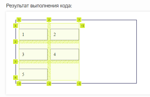
Example . Alignment to the start of the vertical axis in a grid
Let's align our items inside the cells to the start of the vertical axis:
<div id="parent">
	<div>1</div>
	<div>2</div>
	<div>3</div>
	<div>4</div>
	<div>5</div>
</div>
#parent {
	display: grid;
	align-items: flex-start;
	grid-template-columns: 100px 100px;
	gap: 10px;
	padding: 10px;
	border: 2px solid #696989;
	height: 200px;
	width: 400px;
}
#parent > div {
	gap: 10px;
	padding: 10px;
	box-sizing: border-box;
	border: 1px solid #696989;
}
:
Now let's look at our grid in the browser's developer tools:
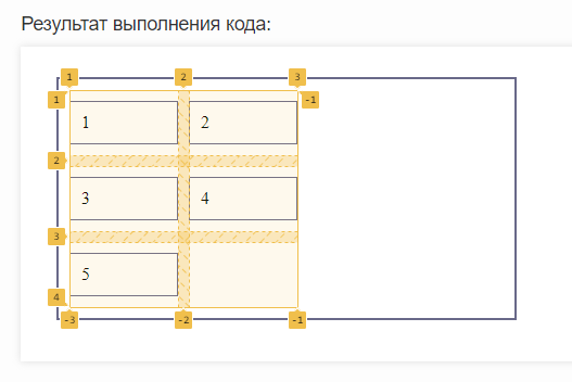
Example . Alignment to the center of the vertical axis in a grid
Now let's align our items in the cells to the center of the vertical axis:
<div id="parent">
	<div>1</div>
	<div>2</div>
	<div>3</div>
	<div>4</div>
	<div>5</div>
</div>
#parent {
	display: grid;
	align-items: center;
	grid-template-columns: 100px 100px;
	gap: 10px;
	padding: 10px;
	border: 2px solid #696989;
	height: 200px;
	width: 400px;
}
#parent > div {
	gap: 10px;
	padding: 10px;
	box-sizing: border-box;
	border: 1px solid #696989;
}
:
Let's see the grid display in the developer tools:
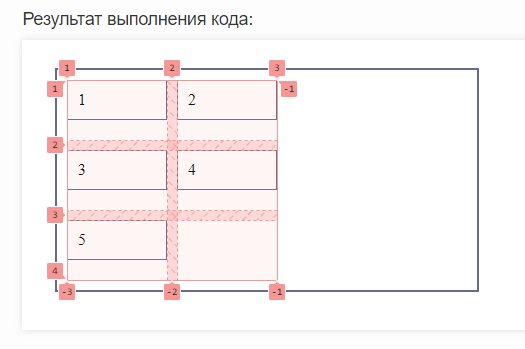
Example . Alignment to the end of the vertical axis in a grid
Let's change the item alignment again, this time to the end of the vertical axis:
<div id="parent">
	<div id="elem1">1</div>
	<div>2</div>
	<div>3</div>
	<div>4</div>
	<div>5</div>
</div>
#parent {
	display: grid;
	align-items: end;
	grid-template-columns: 100px 100px;
	gap: 10px;
	padding: 10px;
	border: 2px solid #696989;
	height: 200px;
	width: 400px;
}
#parent > div {
	gap: 10px;
	padding: 10px;
	box-sizing: border-box;
	border: 1px solid #696989;
}
#elem1 {

}
:
Now let's see what our grid looks like through the developer tools:
See also
-
the
flex-directionproperty,
which sets the direction of the axes for flex containers -
the
justify-contentproperty,
which sets the alignment along the main axis -
the
align-itemsproperty,
which sets the alignment along the cross axis -
the
flex-wrapproperty,
which sets the multi-line behavior of flex containers -
the
flex-flowproperty,
shorthand forflex-directionandflex-wrap -
the
orderproperty,
which sets the order of flex items -
the
align-selfproperty,
which sets the alignment of a single item -
the
flex-basisproperty,
which sets the size of a specific flex item -
the
flex-growproperty,
which sets the greediness of flex items -
the
flex-shrinkproperty,
which sets the shrinkability of flex items -
the
flexproperty,
shorthand forflex-grow,flex-shrinkandflex-basis